Carmen Montanes Martinez
UX Design
Kooth with Kim+Carta
The problem
Kooth is an online, mental
wellbeing community. It offers safe
and anonymous support.
The first aim is to increase confidence among young people.
The second is to reach out and help in difficult and emotional circumstances. Furthermore, it aims to empower the same people to offer help to their peers.
The Solution
I used the Sprint Method to develop a new website.
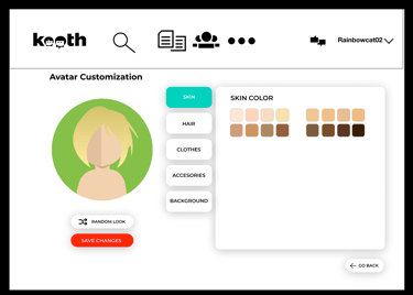
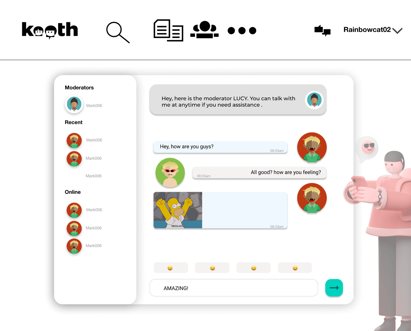
This new website consists of a discussion forum, chat, search bar, avatar customization and panic button.
Sprint Method
Long-term Goal
In 2 years the app will be the most used mental health app for people aged 11 to 18 and recommended by psychologist´s worldwide.
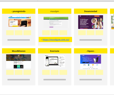
Competitors- Second Research
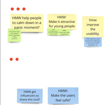
HMW How may we? Solve this problem
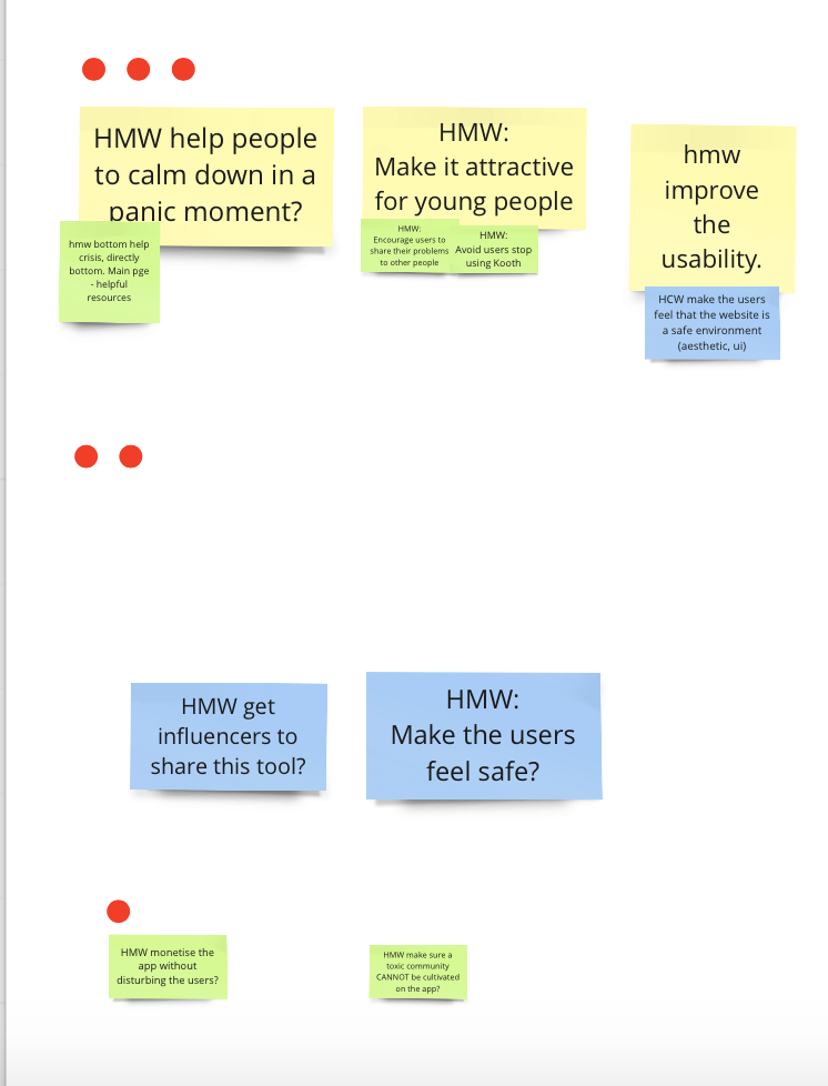
Sprint Questions
Can I help people?
Can I make sure that the app isn´t boring?
Can I make sure that the users return to the app?
Solution
Avatar as a person. Avatars allow individuals to express parts of themselves they might not feel comfortable sharing in real life. This can be particularly
beneficial for those struggling with identity issues or social anxiety, offering a safe space to experiment with how they present themselves to the world.
Customizing an avatar allows users to control their digital image, enhancing feelings of empowerment and agency. For some, particularly those
with physical or emotional insecurities, the ability to create an idealized version of themselves can boost confidence.`
Avatars in mental health chat applications are increasingly being used to facilitate communication, provide therapeutic support, and enhance the user experience. Their use in these contexts has several benefits and considerations, both for clients.
Stigma, Avatars allow users to maintain a level of anonymity, which can be especially important for those seeking mental health support.
This anonymity can help reduce the stigma associated with discussing mental health issues, encouraging more open and honest communication.
Customizable avatars can help users explore different aspects of their identity, particularly in cases where they might feel uncomfortable or
disconnected from their real-world persona. For example, individuals experiencing gender dysphoria, social anxiety, or body image issues may benefit
from experimenting with avatars that represent their ideal or true selves.
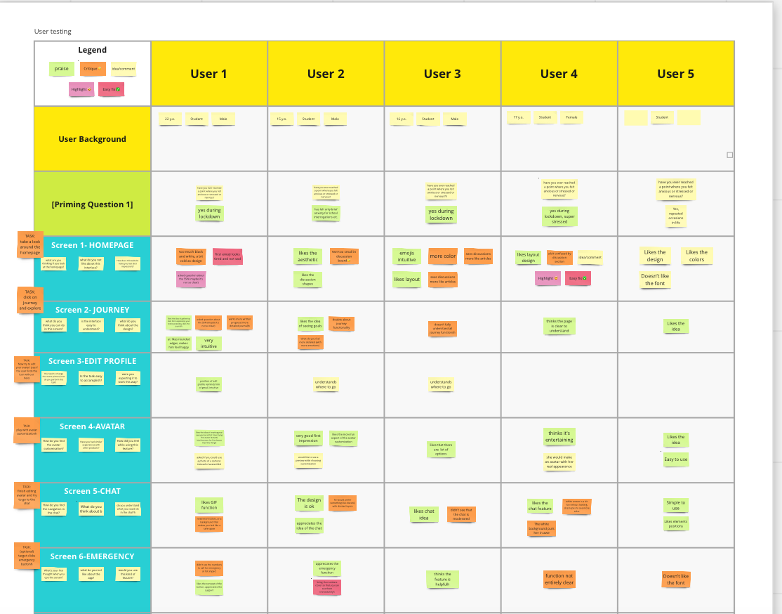
User testing
In short, users generally find the layout and design intuitive but suggest improvements in colour schemes, fonts, and interaction
options (e.g., avatars and GIFs). Avatars and chat functionalities are well-received, while the emergency screen needs better clarification and function clarity.
User background
Positive feedback: User 2 likes the aesthetics, and User 4 praises the layout design.
Critique: User 1 finds the text hard to read, and User 3 suggests using more colour.
Enhancements: User 5 appreciates the design but dislikes the font
Homepage
Positive feedback: Users 1 and 4 like the layout and find the emojis intuitive.
Critique: User 3 suggests more discussion features, and User 2 notes a preference for interaction.
Enhancements: Users 1 and 5 like the layout and intuitiveness.
Journey
Positive feedback: Users 1 and 4 like the layout and find the emojis intuitive.
Critique: User 3 suggests more discussion features, and User 2 notes a preference for interaction.
Enhancements: Users 1 and 5 like the layout and intuitiveness.
Edit Profile
Positive feedback: User 4 finds the interface clear and understandable.
Critique: User 2 thinks it’s very intuitive, while User 5 finds it easy to use.
Avatar
Positive feedback: User 1 appreciates the avatar customization, and User 4 finds the feature entertaining.
Critique: User 2 suggests GIF integration, while User 3 would prefer more realistic avatars.
Enhancements: Users 5 and 4 like the idea and find the avatar system easy to use.
Chat
Positive feedback: User 1 likes the chat concept, and User 5 appreciates the avatar gestures.
Critique: User 2 finds the font hard to read, and User 3 suggests more detailed interactions.
Enhancements: Users 2 and 5 like the interface and functionality.
Emergency
Positive feedback: User 5 finds it simple to use.
Critique: Users 3 and 4 find the function unclear.
Enhancements: Users 4 and 1 suggest refining the layout for better clarity.
#I worked on a project with Kim+Carta and Kooth in the second year of my degree, collaborating with the client Kooth on a real project.
#For my honours project in my fourth year, I created an app called Eletripollen.
Electripollen
Be a bee and charge your electric car at public electric charging points
Honours project. Edinburgh Napier University 2023
This case study is the approach to how UX an improve electric cars and their connection with EV charging networks in the UK.
Contrasting primary data from academic literature: Google Scholar, Edinburgh Napier University library,Science Direct and GOV UK.
The target audience is drivers 18-65 years old who live in the UK.
Process Thinking
Design thinking- Lean UX- Agile.
1.Secondary research to analyse competitors, user need groups, and assumptions about the niche market, pain points, and guidelines.
2.By employing Design Ethnography to observe users in their natural environments, this method yields qualitative data rather than quantitative.
3.Generate interviews with users by questionnaires, then use Affinity Diagramming for Contextual inquiry to research qualitative data.
Portobello electric charging point. Carmen's photo
Process Thinking
Design thinking- Lean UX- Agile.
1.Secondary research to analyse competitors, user need groups, and assumptions about the niche market, pain points, and guidelines.
2.By employing Design Ethnography to observe users in their natural environments, this method yields qualitative data rather than quantitative.
3.Generate interviews with users by questionnaires, then use Affinity Diagramming for Contextual inquiry to research qualitative data.
4.The data will analyse by Brainstorming Graphic organisers -flow diagrams; in thismanner, the data is represented in a visual way user’s actions.
5.This study will develop a Persona and User Journey from the data collected which provide.
6.How might - Sprint- questions; therefore how I might resolve the problem.
7.Solution ^ _ ^
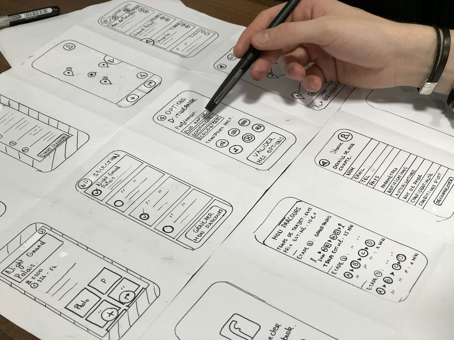
8. Sketching is important because it helps visualize ideas quickly, iterate designs, communicate effectively, solve problems, gather feedback early, and is cost-effective.
9. Wireframes to develop an excellent UX design.
10.Prototyping a new app to solve the problem concerning the connection between user and electric cars. Thus, it is working on a new concept of sustainability.
11.Feedback- User Testing by using Heuristic Evaluation method and Kano Analysis
Solution: App
The problem
The main problem concerning EVs is that charging many of these vehicles
from the grid supply system imposes an extra charge on them, especially
during peak hours, which results in high per-unit costs. Moreover, users get
lost because of apps that have existed for years in the market;thus they
must provide a better router planner.
The Solution
An efficient mobile device application (apps) about electric charging stations can develop a plan to
solve this issue.
This new app called Electripollen can recognise all public and non-public electric charging points.
Likewise, this app provides price, photo, location, EV Models, boot chat, payment by card, PayPal, NF,
Apple Pay, and router planner.
In conclusion, the solution consists of including a menu on the top to facilitate the navigation of the app. Moreover,
a log-off feature is necessary because it benefits the user to control her or his menu. On the personalised menu
should be a clickable edit button which now is not working. Most users want a car animation rather than a brand
logo and therefore the designer must create a new animation relating the app’s logo with electric cars because the
user would not understand the idea.
Concerning the chatbot it would be better if it connects with a person rather than a system, however, the chatbot is
necessary to filter the task to do this for the company such as when a call centre filter calls to report it to the
expert department. This is an electric commerce tool highly used at the moment, and it is working for users who
require excellent customer service.
About error prevention, it must include in the app because the user needs to recognise mistakes when they
perform a task and avoid dark patterns that could be on the system. For instance, the payment feature must be
confirmed three times otherwise the user can buy products without an intention. Moreover, the payment does not
give any verification when you pay. Thus, the designer must include the feature of double authentication because
the user could make a mistake about her or his details.
New solution
First screen Login or Register
Register
Bot help
Router Planner
Filters to find a better router
Payment
The Electripollen app may cost 15K-30K to develop and advertise with the projected return being
£6,893,100 because the subscription is £9.99 per month for 690,000 electric car users per year and
may cost 15K-30K to develop and advertise with the projected return being £6,893,100 because the
subscription is £9.99 per month for 690,000 electric car users per year.
In the UK, Scotland has the highest number of EV charging devices per 100,000 of the population
(47), followed by England (36), Wales (29), and Northern Ireland (17). The use of Electripollen will
increase as more people buy an electric car or hybrid. In 2022 sales figures increased by 40%. By 2030,
GOV UK will not allow building petrol cars, thus users will change their cars to electric cars or hybrid.
Furthermore, in 14 years improvements will be seen in electric batteries and charging infrastructure
in the UK; therefore, more users will trust electric cars and hybrids than in previous years.
This is an increment of 80%
I used Kano analysis and Heuristic Evaluation to improve the app
Carmen Montanes Martinez
UX Designer, Data Science and Ilustrator.
© 2024. All rights reserved.